 eLearning map at http://www.atenea.it/international/Etna/map/e-learning.jpg
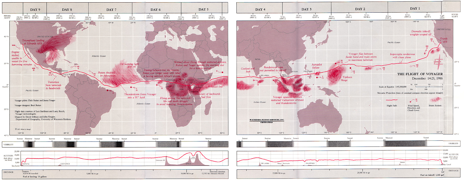
......................................... Interesting Timeline / Infographic ---->
Tufteisms from The Visual Display of Quantitative Information (1983):
Graphical excellence is the well-designed presentation of interesting data - a matter of substance, of statistics, and of design.
Graphical excellence consists of complex ideas communicated with clarity, precision, and efficiency.
Graphical excellence is that which gives to the viewer the greatest number of ideas in the shortest time with the least ink in the smallest space.
Graphical excellence is nearly always multivariate.
The revelation of the complex.
Graphical excellence requires telling the truth about data.
Graphics must not quote data out of context.
Above all else, show the data.
Clear, detailed, and thorough labeling should be used to defeat graphical distortion and ambiguity.
Write out explanations of the data on the graphic itself.
Label important events in the data.
The number of graphic dimensions depicted should not exceed the number of data dimensions.
Forgo chart junk.
Maximize the data-ink ratio.
Erase non-data and redundant-data ink.
Revise and edit. From http://www.cartotalk.com/index.php?showtopic=285
Cartography is Dead (Thank God!) (download/view the PDF here originally published in Cartographic Perspectives number 45, Spring 2003) by Denis Wood : http://makingmaps.owu.edu/mm/cartographydead.pdf
Throughout history maps have taken on meaning well beyond their practical application of providing directions. Artists have always been interested in maps. As author Julia Cameron stated, "The artist is a cartographer; he maps the world. The world within him, and the world as he sees it." http://www.johnsonese.com/ (This show will feature art about or made from maps by 16 artists from across the US: Kim Baranowski, Aileen Bassis, Pip Brant, Eileen Doughty, Rodney Ewing, Dawn Gavin, Pamela Goffinet, Greg Haberny, Tamara Kostianovsky, Lilianne Milgrom, Garry Noland, Betsy Packard, June Szabo, Adrianne Watson,Scot Wittman, Jeff Woodbury).
Best example of muti-panel animated GIF http://blog.loaz.com/media/crazy.gif simulating linear motion.
Safety themed imagery : http://images.google.co.th/imgres?imgurl=http://www.safetycenter.navy.mil/ashore/images/ormelearning.jpg&imgrefurl=http://www.safetycenter.navy.mil/ashore/articles/ORMe-learning.htm&h=654&w=780&sz=138&tbnid=7AvlfbvMyPQJ:&tbnh=118&tbnw=141&hl=en&start=48&prev=/images%3Fq%3De-learning%26start%3D40%26imgsz%3Dxxlarge%26svnum%3D10%26hl%3Den%26lr%3D%26sa%3DN
"For every person with a spark of genius, there are a hundred with ignition trouble. - ?
No comments:
Post a Comment